Close

Adxpoint is a cutting-edge advertising technology platform offering monetization solutions for publishers and advertisers across search, display, video, and CTV. With access to premium ad feeds from Bing, Yahoo, and Google, the brand empowers performance marketers and ad networks to scale with precision. Their suite includes OpenRTB integrations, XML traffic solutions, and real-time campaign optimization tools.
View Website
Adxpoint approached us with a need for a distinct brand identity that could reflect the sophistication and trust their platform delivers in the highly competitive ad tech space. The logo had to strike a balance between professionalism and innovation – something that would resonate with both advertisers and publishers. Additionally, the brand’s identity needed to look credible in both tech-heavy and client-facing contexts.
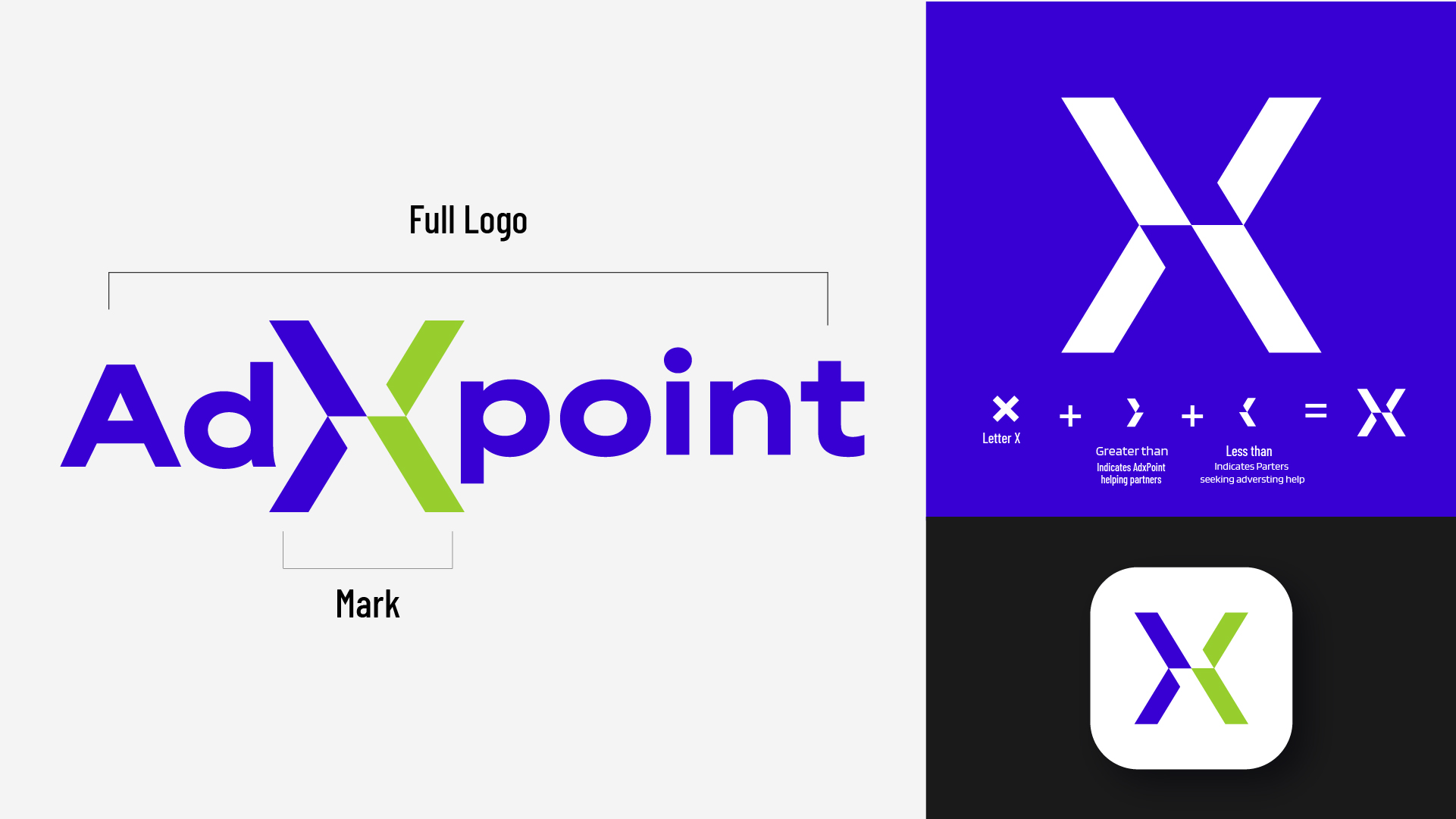
To visually represent Adxpoint’s core values, the design strategy centered around three key themes: connection, precision, and forward momentum. We began by analyzing industry trends, competitor identities, and the visual expectations of stakeholders in the programmatic advertising ecosystem. The letter “X” emerged as a strong visual anchor, symbolizing the intersection of data, demand, and delivery.
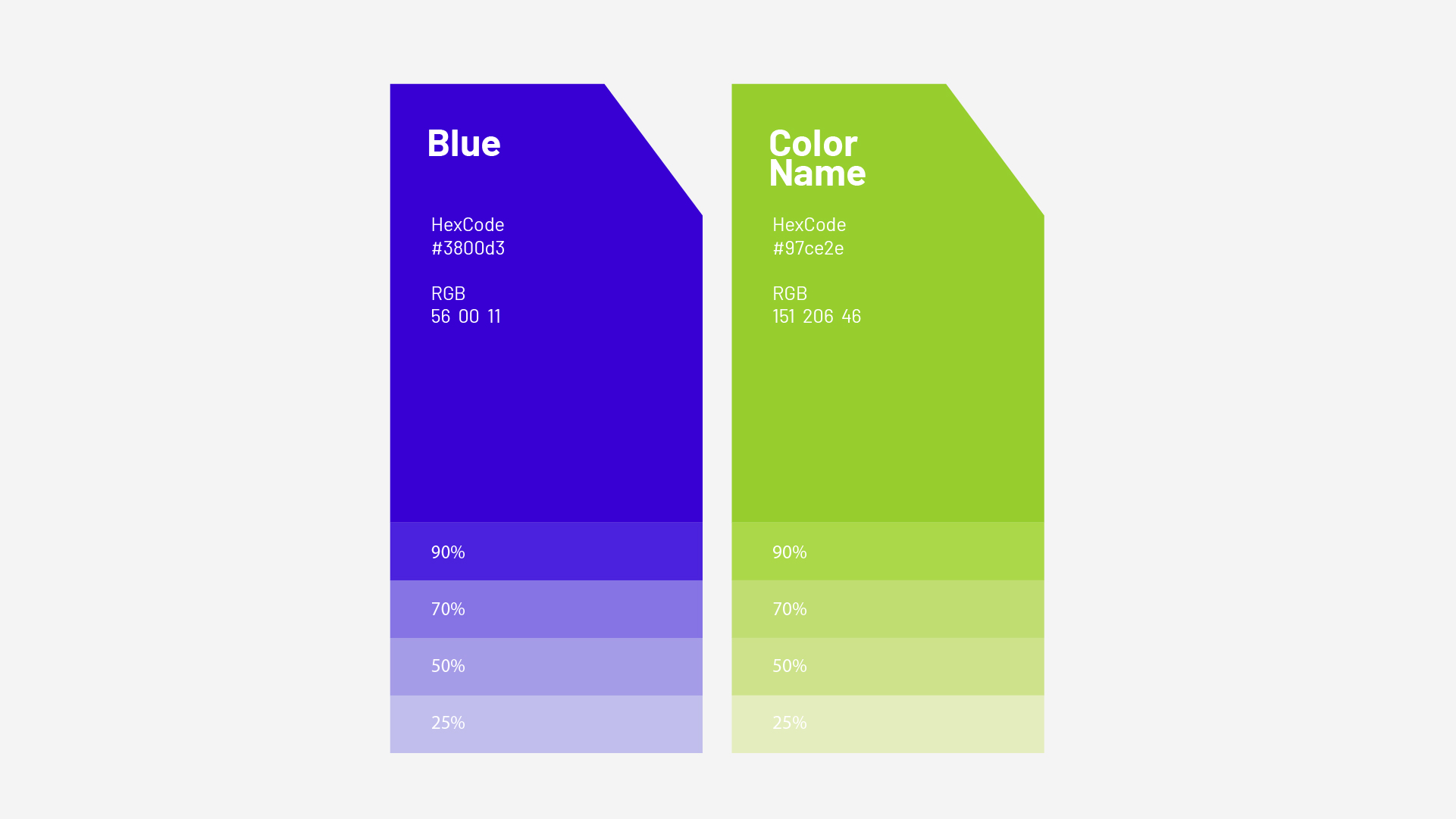
We explored clean, geometric typography to convey clarity and professionalism, while incorporating directional and dynamic elements to reflect movement, targeting, and scalability. The chosen color palette strikes a balance between trustworthiness and technological innovation, ensuring the final identity feels both confident and future-ready.
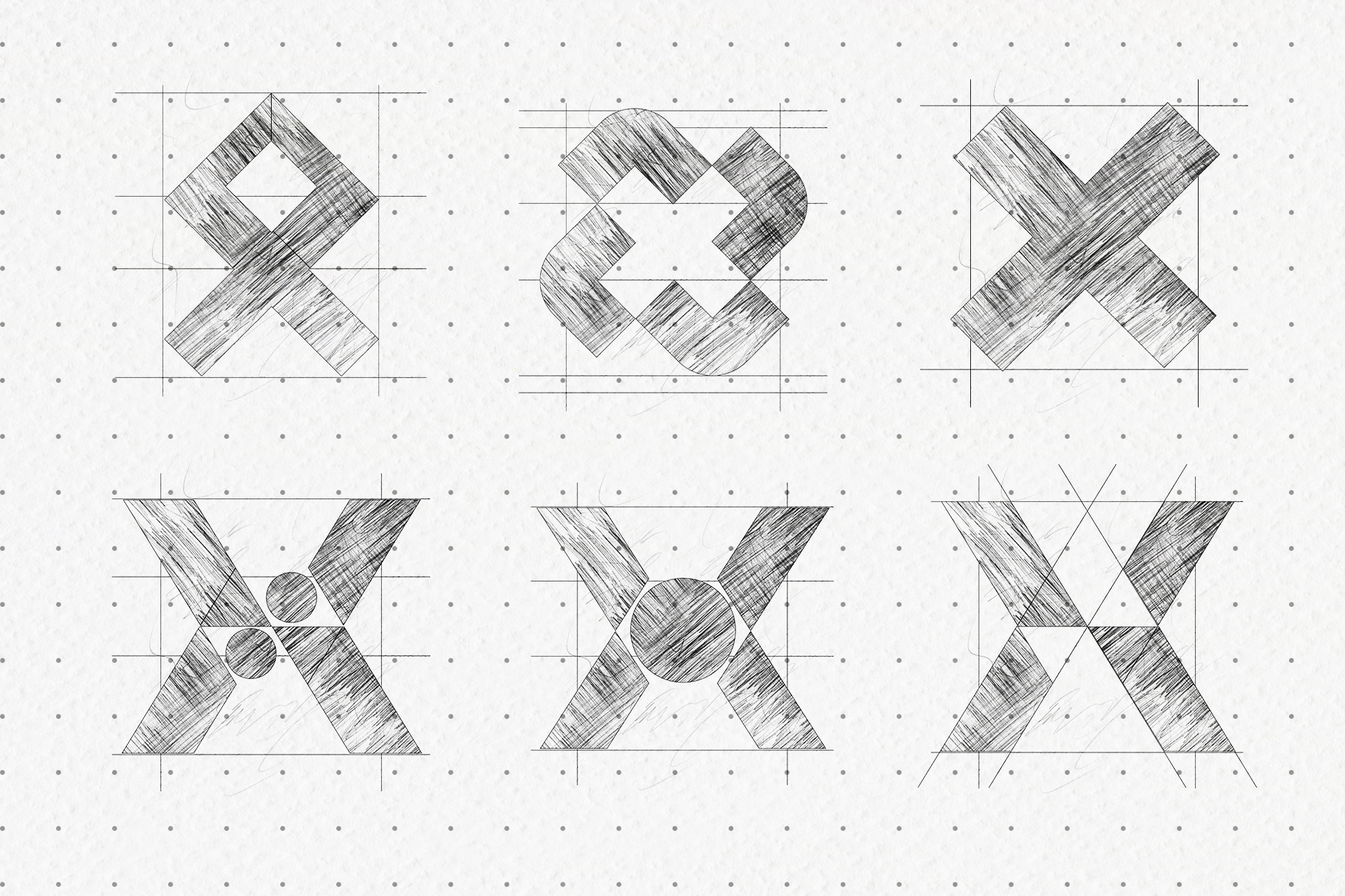
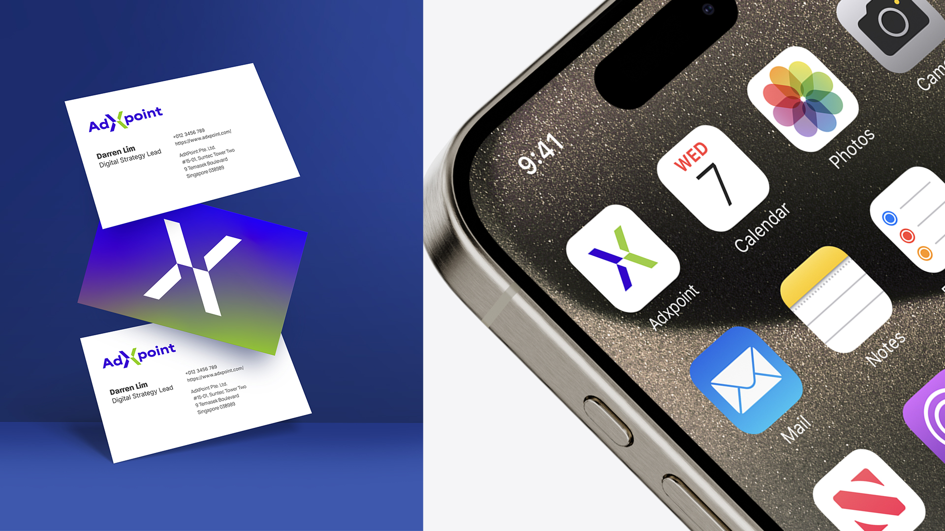
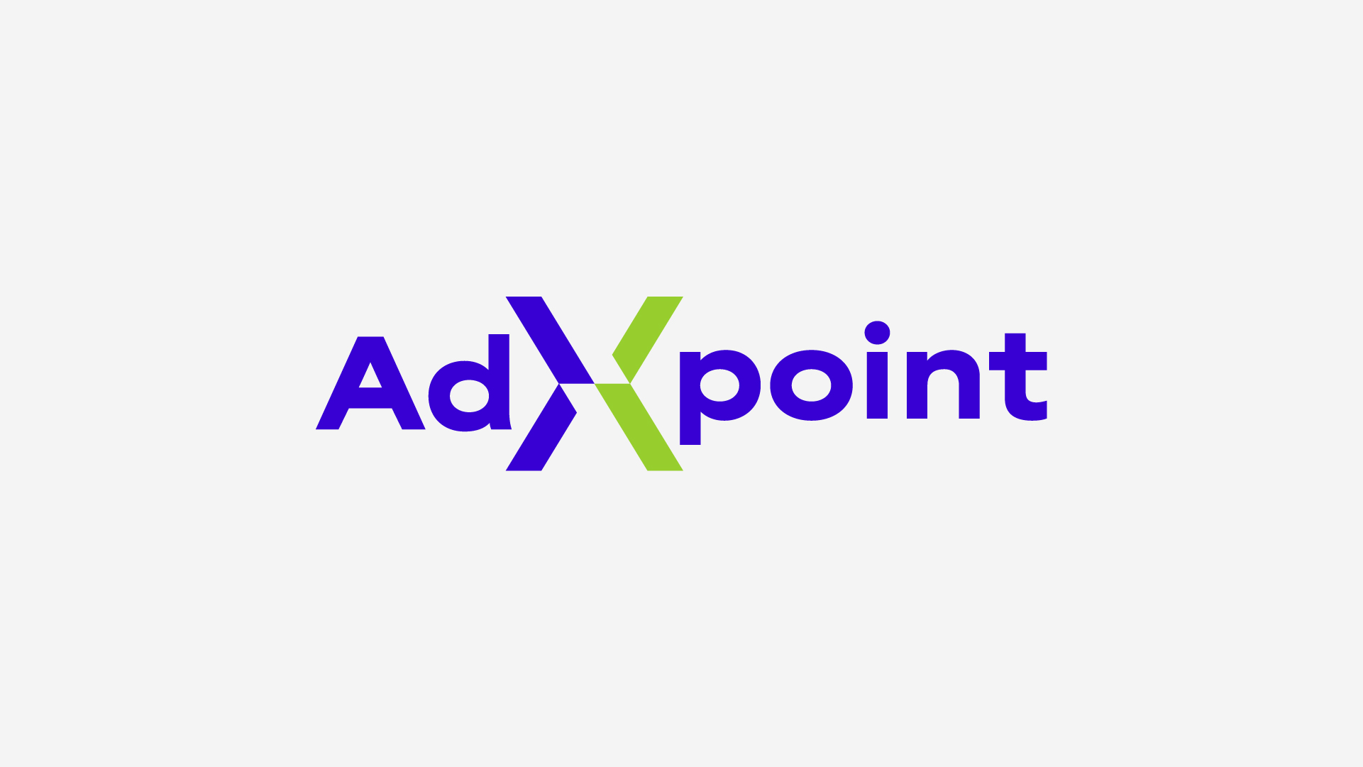
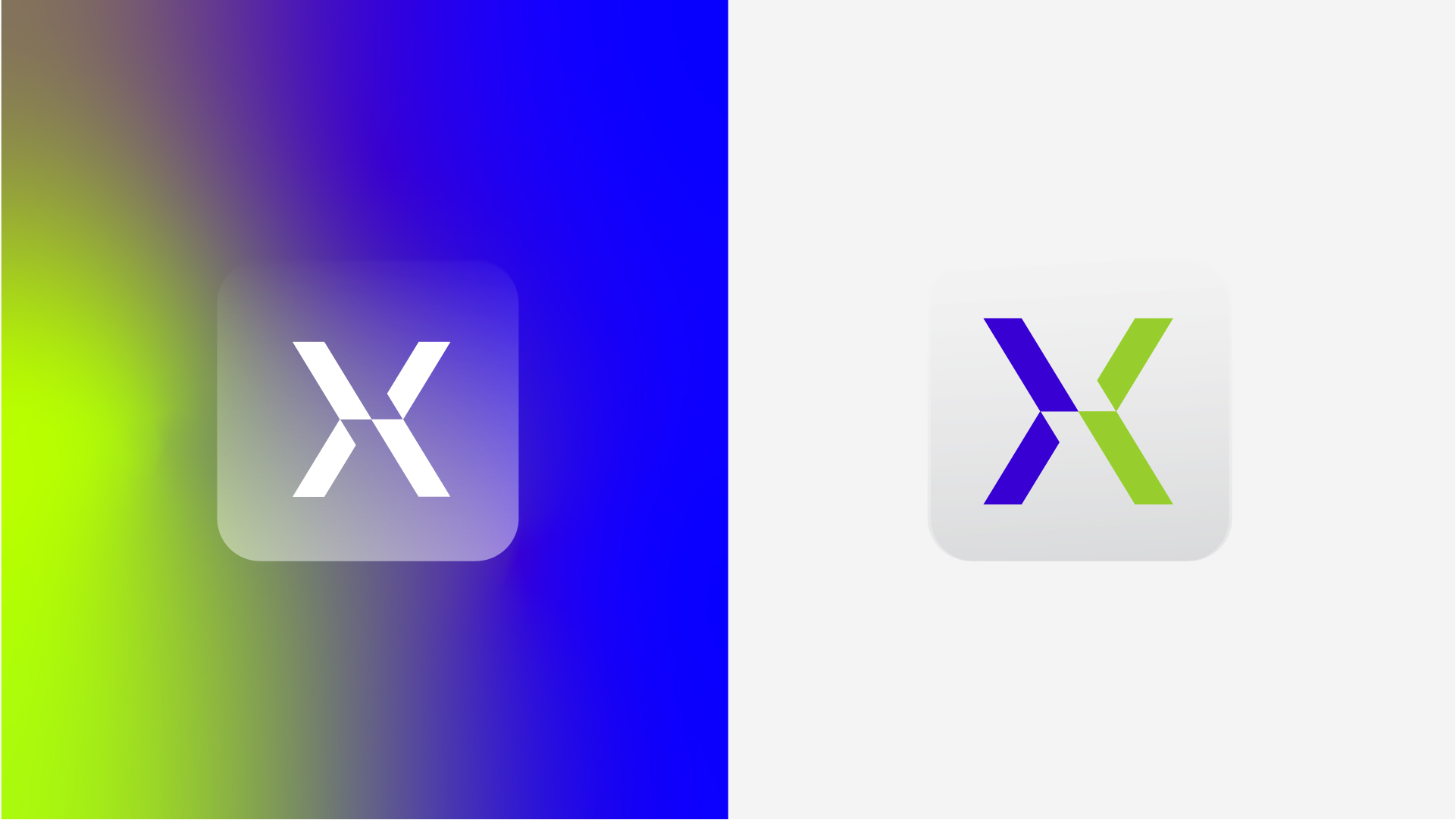
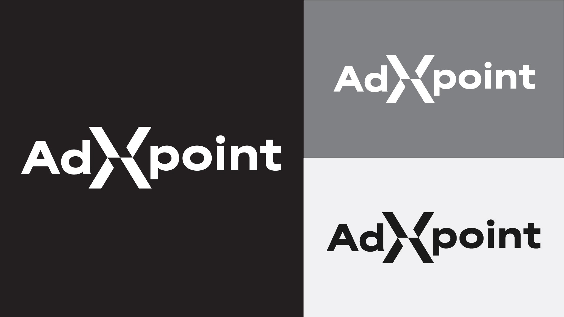
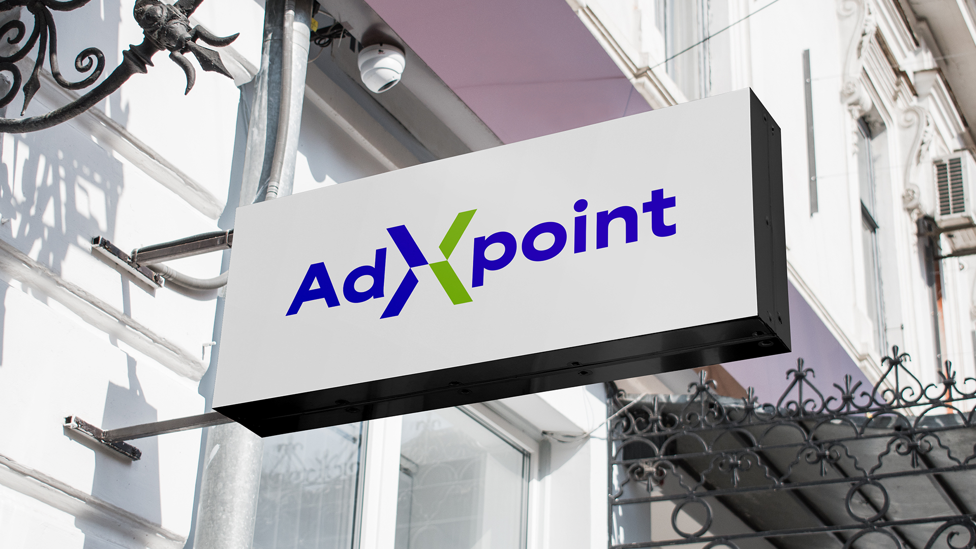
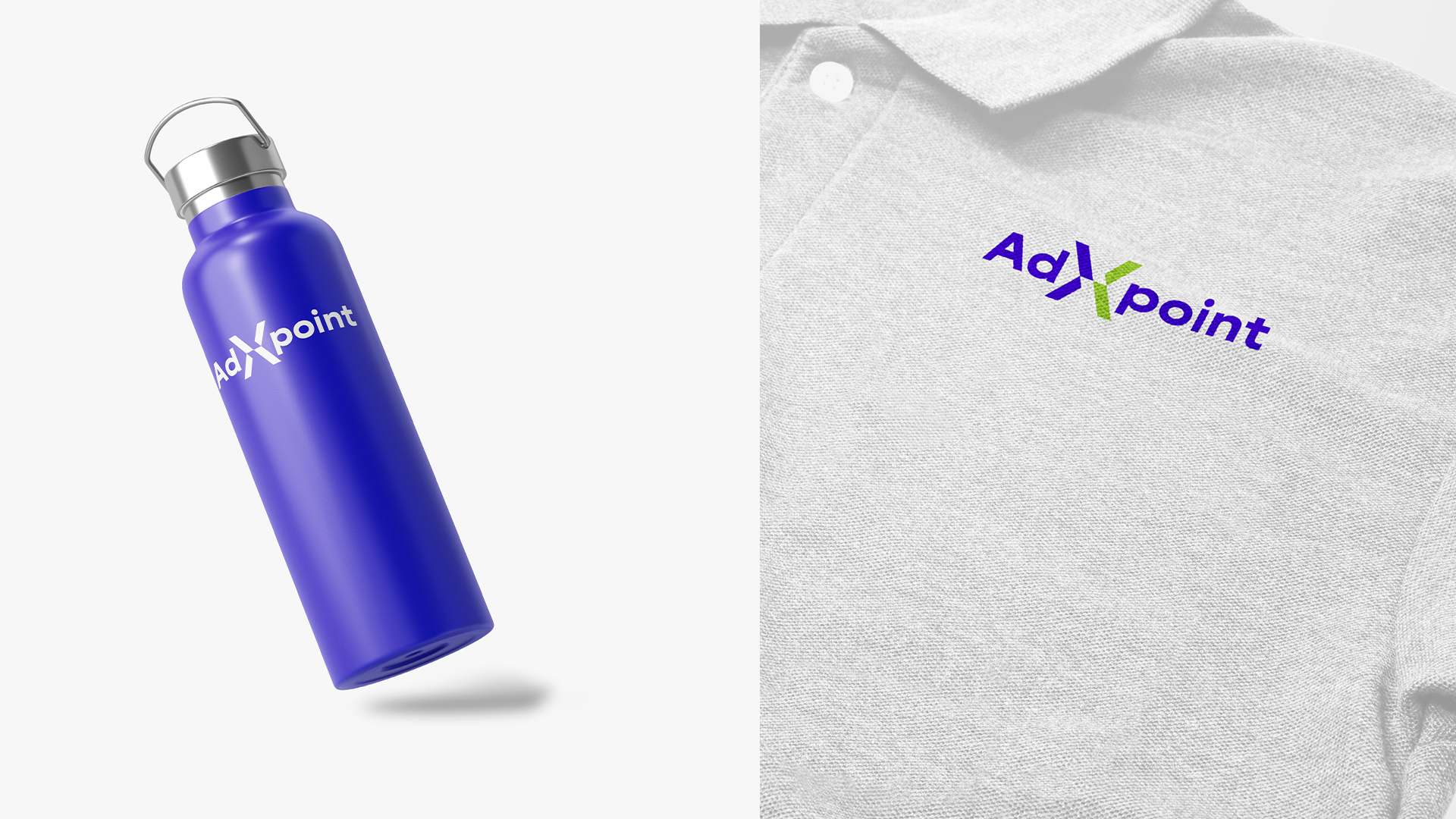
The final logo for AdxPoint captures the brand’s core promise—acting as a central connection point in the advertising ecosystem. The custom “X” is built from the “greater than” (>) symbol, representing AdxPoint enabling growth for advertisers, and the “less than” (<) symbol, representing partners seeking support. Their intersection forms a unified mark that reflects collaboration, precision, and momentum. Clean, angular construction suggests movement and modernity, while bold, geometric typography reinforces clarity and confidence. The blue and green palette balances trust with growth, resulting in a versatile, digital-first identity that scales seamlessly across platforms and touchpoints.


We’re a digital agency focused on creative and results-driven solutions.


